
This year without a doubt, has given us several surprises and a completely deep focus on the user, is one of them. Our point of view is that we must reinforce the concept of a simple, pleasant site and the most important thing useful especially on mobile is what is going to stay.
We share 10 trends that we consider to be the ones that will give something to talk about in 2020:
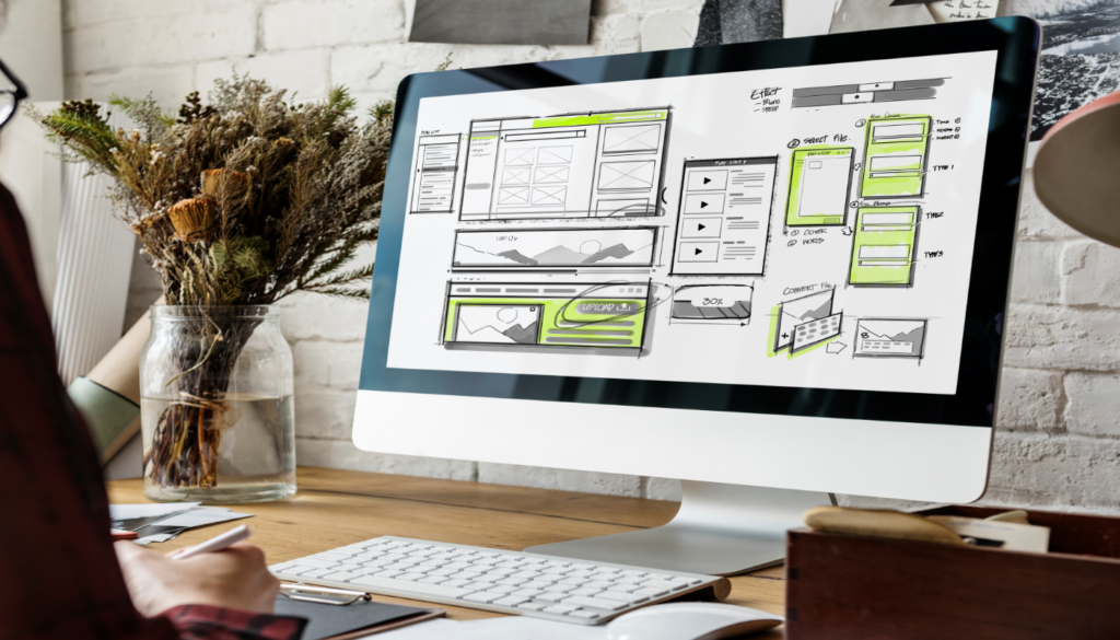
#1 Minimalism to the maximum: This type of design tries to remove unnecessary elements. Remember less is more. And the goal is to offer clean and simple sites that manage to convert better. In other words, a linear design. Attention: It is not taking a site to the extreme that is black and white and that’s it. You can handle subtle elements because you remember that the protagonist is the content.
#2 Navigation: It is starting to circulate websites with basic navigation and totally hiding it, especially on mobile. The user already knows how to find the navigation options, so why show them several. There are certain disagreements with the hamburger menu that is undoubtedly widely used and is a good option, especially for websites that sell. But for others, they explain that what we do is to add one more step to the user. Our point of view is that we think the idea of hiding the entire menu is great, because it gives more visibility to the content and the user focuses on what is specific.
#3 Hero Titles: Big Titles, we love this. It makes the user, at their first sight, easily understand what you are talking about or what is simply objective of what you are showing them. If you dare to do it, analyze the words to use very well, because it is not as easy as it seems.
#4 Outline Fonts: We start talking about simple and very visual letters. This is one of our favorites. It makes a site attractive, clean and easy to understand. The famous Outline fonts are plotted versions of web fonts
#5 Asymmetric Designs: This function must be very well thought out so that the site does not seem loaded. The proposal is to organize the elements very well, in order to focus the user’s attention on what is important. That is, always highlight the part that interests you the most to show.
#6 Animations but not in excess: Many overdo themselves doing a lot of animations that what they cause is visual fatigue and overloaded web. That is, use them but without exceeding ourselves. Please do not use those old GIFs, that they do is make the page take longer to load. Now it is animated with CSS or SVG code which makes the image not distorted and gives the user an interactive experience on your website.
#7 Few Colors: The more color the more beginner you look. We know that the idea is to look fun, edgy, but do not saturate or play with a lot of colors. The degradations of the same tone are usually very helpful and generate a good contrast.
#8 Images: 3D is booming but please make it real, that you can turn in any direction. But, as many blogs believe that this type of development will not be 100% true. They are expensive and of course it gives an incredible aspect, but you have to convert it to know what monetary value it will generate you by giving this experience.
#9 Lots of text: Multimedia content and stories. We know that everything enters through the eyes, but the words convince, generate empathy and well, much more with all this SEO boom. It is important to visualize the handling of paragraphs, offer enjoyable content, easy and that encourages people to scroll.
#10 Chatbots: Everyone talks about this, and they are here to stay. This facilitates communication and the way for the user to carry out actions with the brand. Without leaving behind that generate confidence and security when making a purchase, or have doubts regarding a service. But we believe that it still lacks time for most of them to be used. The reasons are: First, it has an extra cost and if you use a free one they are bad. Second, they require programming and a journey that must be worked in depth if you want them to truly contribute to a user’s process. Third, not many are used to it and it is difficult to know that you are talking with a robot and not a human being. This generates a little frustration for them.
For some years the web has taken a 360 turn, the trends are maintained and what is coming are little things that reinforce what has been working for years.
We invite you to subscribe to our newsletter and receive exclusive content